In this post, I will teach you how to plot a dataframe you created in Pandas.
Plotting a dataframe using Matplotlib
This is my sample dataframe whose graph I would like to draw.
import pandas as pd

my_data = {'Tax_Rate': [0.1, 0.2, 0.3, 0.4, 0.5, 0.6, 0.7],
           'Taxes_Collected': [100000000, 120000000, 170000000, 260000000, 210000000, 80000000, 40000000]}

my_df = pd.DataFrame(my_data)
I wanted to represent the Laffer curve, so I chose lines and bars.
To plot the chart I will use the matplotlib module which I need to import.
import pandas as pd
import matplotlib.pyplot as plt

my_data = {'Tax_Rate': [0.1, 0.2, 0.3, 0.4, 0.5, 0.6, 0.7],
           'Taxes_Collected': [100000000, 120000000, 170000000, 260000000, 210000000, 80000000, 40000000]}

my_df = pd.DataFrame(my_data)

my_df.plot.bar(x='Tax_Rate', y='Taxes_Collected')
plt.plot(my_df)

plt.show()
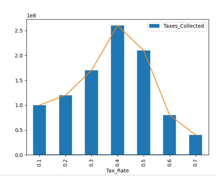
This is the simplest plot you can create from a dataframe using matplotlib. The matplotlib module also allows you to expand the plot further to suit your needs.
Plotting a dataframe using Seaborn
You can plot a dataframe another way by using Seaborn library.
Seaborn makes it easy to create aesthetically pleasing plots. To plot revenue and expenses over time, use the lineplot function:
import pandas as pd
import seaborn as sns
import matplotlib.pyplot as plt

data = {'Year': [2010, 2011, 2012, 2013, 2014, 2015, 2016],
'Revenue': [100000, 120000, 150000, 180000, 220000, 250000, 280000],
'Expenses': [70000, 85000, 90000, 105000, 120000, 130000, 140000]}

df = pd.DataFrame(data)

sns.set(style="whitegrid") # Customize the plot style
sns.lineplot(data=df, x='Year', y='Revenue', label='Revenue', marker='o')
sns.lineplot(data=df, x='Year', y='Expenses', label='Expenses', marker='o')
plt.title('Yearly Revenue and Expenses')
plt.xlabel('Year')
plt.ylabel('Amount (in USD)')

plt.legend()
plt.show()
This code uses Seaborn’s lineplot function to create a visually appealing line plot of yearly revenue and expenses.
See also:
Matplotlib plot documentation
How to insert bar chart in Excel
Pingback: How To Read Multiple Excel Sheets In Pandas • Pandas How To